
Case Study: Metlink Mobile App
The Metlink public transportation app isn't user friendly. It assumes users have pre-existing knowledge. How might the experience be redesigned to be more intuitive while still keeping things lightweight for commuting users?
Context for the Reader
This was an individual academic project and my first UX case study and prototype. In hindsight, I would do several things differently now, but this was an extremely valuable learning experience nonetheless.
Introduction
I recently moved to Wellington, New Zealand from the United States. Unless you live in a bigger city like New York, most people in the states do not use public transportation at all. Most of us commute via car.
This means I needed to not only familiarise myself with a new city, a new culture, and a new country, but also public transportation in general. Naturally this was a little overwhelming.
This meant having an intuitive and effective journey planning app available on my phone for public transportation was imperative to an enjoyable commuting experience.
The goal of this project was to re-design the existing Metlink Mobile app based on my research insights.
Problem
The Metlink app does not provide adequate journey planning capabilities in a single experience; it assumes you have existing knowledge and requires you to go to several different places to get all the information you need.
Hyothesis
Users don't want to go to multiple places to plan their journey. They want to be informed of current conditions relevent to them, have the ability to set start and end points to search routes and see timetables, save favourites, and purchase ticket fares all in one app.
My Process
User Interview

Because this was my first UX case study, I had a lot of learning to do. If my process looks a little chaotic and iterative rather than linear, that's because it was! It was, however, rooted in the double diamond framework.
All of this iteration is a good thing, and how the double diamond process is really intended to be. If we approached case studies with a strictly linear process, we'd be missing the point of the exercise by ignoring the opportunities to improve through applying feedback, user insights, and learning from our failures quickly.
I learned that experimentation and frequent iteration based on new insights is the best way to achieve an outcome.
UX Teardown
The first thing I did for this project was get some hands on time with the existing app and run through a formal UX teardown exercise for journey planning while checking aesthetics, usability, and overall experience.


UX Teardown Summary
Overall this app is not user friendly, and because it isn't intuitive, it's quite frustrating. It is not consistent with the desktop or mobile site and is lacking critical features like proper journey planning, and fails at the features it does have. The app assumes that you know bus stop numbers, which is a critical blow to users like me, who just moved to Wellington and don't know the area.
"The app assumes that you know bus stop numbers, which is a critical blow to users like me, who just moved to Wellington and don't know the area." - User
Heuristic Analysis
Along with the UX teardown, I conducted some heuristic analysis of the Metlink app to see where the strengths and weaknesses are related to the below principles.
Heuristic analysis helped me identify, at least initially, which features I wanted to focus on improving during prototyping.
Visibility of System Status
-
(sustain) Loading icon is present when starting up app
-
(sustain) Banner at top of page notifies user of updates to their favourite routes (if any are saved)
-
(improve) When I select a notification, it redirects me out of the app to a browser without any warning
-
(improve) When I read a new notification, it is still marked as "new" afterwards
User control and freedom
-
(sustain) Standard notification privacy settings for push notifications give the user the option to decline.
Consistency and standards
-
(improve) The app is very different from the desktop and mobile Metlink sites, and this is confusing - specific example is the inability to journey plan with start and end locations
Error prevention
-
(improve) Because the app is not intuitive, and does not provide a lot of user feedback, it is frustrating, and will likely result in a low adoption rate due to incorrect use
Recognition rather than recall
-
(improve) Each screen is not very intuitive and does not mimic what users are used to with the Metlink website and other commuter apps, so it is a difficult app to learn because of the way it is designed
Flexibility and efficiency of use
-
(sustain) The app is flexible in the sense that it shows all stops and all stations on a map, allowing the user freedom to explore routes, set favourites, and customise notifications
-
(improve) However, it is not efficient because of a number of factors including too much information on the map at one point in time, inability to set start and end locations to figure out direction of travel, and if you don't know bus stops already, you will be lost when trying to plan a journey
Aesthetic and minimalist design
-
(sustain) The aesthetics, colours, and icons are minimalist and match the Metlink brand
-
(improve) The app is too lightweight, resulting in a confusing and frustrating experience. Minimalist design was taken too far in terms of functionality
Help users recognize, diagnose, and recover from errors
-
(improve) The app fails this test
Help and documentation
-
(improve) An onboarding banner directs me to get started by heading to the favourites tab to add favourite services. But when I tap on the favourites tab it tells me to go back to the map to find a stop and then add it to favourites.
-
(sustain) There is an extensive help and documentation page built into the app.
Competitive Analysis
At this point in my research I started having casual conversations with other Metlink users. The general consensus about the Metlink App was that it was pretty ineffective. One user from Auckland mentioned to me that he thought the Auckland commuter app was really well done in comparison, and he suggested that I take a look to see what they did differently. I also spent some time looking at the Moovit app for ideas since it had great reviews as well.
Competitive analysis showed me what good Journey Planning design can look like, which helped me understand why the Metlink app wasn't working.
User Ratings & Reviews

Next, I spent some time looking through user ratings & reviews data for the Metlink app on Android and iOS app stores to help understand what the wider user pool thought, and see if I was on the right tack.
Ratings & Reviews analysis was a quick and easy way to start getting user insights prior to my own surveys and interviews.
The Metlink app rating at the time of writing this case study is only 2.1 out of 5 stars on android, based on 247 ratings, which reinforces the need to improve this user experience. The rating on iOS is 2.4 out of 5 stars, although that is based on only 5 ratings.
Ratings & Reviews highlights:
-
Basic Journey Planning is missing from the app entirely
-
Users don't like that they have to search a stop instead of a destination
-
Can't add favourites on the favourites tab
-
The app isn't like the website at all, not as useful
"The search functionality is awful and if you're not familiar with the bus routes, unhelpful. I should be able to search for my destination and see my bus options not search for a bus stop." - User
-
Basic timetables are missing
-
Overall confusing - not user friendly/intuitive
-
Notifications are often irrelevant - i.e. bus notifications when users only care about train lines
-
Notifications don't disappear after reading them
"The whole point of a "commuter" app is to plan journeys, but the designers deliberately chose NOT to include this feature to "keep the app light", making it utterly useless to me. " - User
Key Takeaway from this exercise:
-
Confirmation that most users agree that the single greatest enhancement would be to add a core feature for traditional journey planning. This backs up my hypothesis. This should have been MVP at launch.
User Interviews, Surveys & Observations
I used a combination of surveys and in-person interviewing to gather user experience data about the existing Metlink app. I then used that data to find existing themes around problem areas, user needs, and suggestions for improvements.
The interviews and surveys I conducted as a part of my research was critical to understanding the wide ranging Metlink app users and their different perspectives and needs. Some are very familiar with the region, others are new, some ride the train, others take the bus. Each different group of users has different needs and objectives. This type of user insight and interaction simply cannot be substituted through other research. Ultimately this helped me identify areas to focus on and helped me start thinking about narrowing my user focus down to a specific group.
Feedback Insights:
"I have abandoned the app altogether and use the mobile site because the app is so hard to use." - User
"As someone new to the city, I didn't know which buses or routes I needed to take to get to particular places so I had to compare with google maps." - User
-
Five out of seven users rated the Metlink App as 1 out of 5 stars, with an overall rating of 1.3 out of 5 stars.

-
over 80% of users said they use Metlink Services several times a week
-
When asked what they thought could make the Metlink App experience better, seven out of seven users said they wished journey planning was better on the app
-
On a scale of 1 to 10, enhanced journey planning, favourite routes, notifications, & real-time tracking were rated the highest, however, interest in other areas was fairly evenly spread as well, including ability to purchase digital tickets, viewing time tables, and filtering by service.

-
Several users mentioned that they like some of the features of the Metlink web site, and wish that the app would be more like this.
-
A common request was the ability to set destination and starting points when searching for a route instead of searching for a stop on a map - but they did like the ability to search on a map for an overall top down route view - they just want the ability to do both
-
When speaking to users in-person, several mentioned they either got so frustrated that they deleted the app, or that they need to supplement the apps features by using additional apps to meet their needs
-
Saving favourite routes is important to users
-
Tailored notifications are important to users - specific to favourite routes
"I still don't understand why there isn't a welly-wide single payment plan...like snapper on everything." - User
All feature enhancement suggestions in the survey were valuable to different groups of users. I needed to find a way to narrow my focus when building the prototype. There were some obvious themes in user feedback that helped me focus - like enhanced journey planning & favourites.
"I like the ability to view timetables by stop. Although this is useful it is not easy to use." - User
Card Sorting
Card sorting was a great exercise that provided me with some real user insights on how to design my prototype flows, categorise features, and organise page groupings.
The insights I gained here greatly influenced how I iterated my initial prototype along with usability testing feedback.
"These are things I don't necessarily need all the time - they shouldn't be the main focus of this app, but they are useful to have." - User
"Would it make more sense to ask for start and end locations, kind of like Google, rather than what service I want to use?" - User


"Let's say I live in Johnsonville and want to get to Wellington - there might be a bus or a train, but if I'm new I don't know which service is the best one to take." - User
"Then a new user could choose from multiple options based on expense or convenience." - User
Narrowing Focus & Reframing the Problem
Based on all of my research, and especially the card sort exercise, the group of users that I want to focus on is those who are new to the region. Right now the Metlink app is excluding these users because they get frustrated and stop using the app. By solving the journey planning experience in a way that makes sense for those who are not at all familiar with the area, we will not only be including these users in our design, we will also be creating a more user friendly experience that benefits those who do know stations, stops, and routes, but want the flexibility to plan their journey using a map or start and end points.
Refined Problem Statement:
The Metlink app design does not take into consideration new users who are unfamiliar with bus stops and stations in the region. The application assumes you have this knowledge, which ultimately discourages use of the app.
Refined Objective:
Design the Metlink app in a way that simplifies journey planning for new users without assuming they have knowledge of the area, but also offers additional value that the websites do not.
Persona
I was able to leverage past Metlink service design research where I had already put together customer journey and empathy maps. At this stage a persona would help narrow my user focus.

Ideation
Summary of Feature Enhancements & Redesign Proposals
Based on my research, I focused on adding journey planning that is intuitive for new users that actually lets the user set start and destination points and serves up different service options, but also adds unique features that provides value the website does not.
I also set out to display useful and relevant information to users based on favourites and current routes before planning, while planning, and during travel to ensure a smooth experience.
Overall I think this approach will help solve the problem outlined above.
User Stories
User stories help keep the focus on the end user, their needs, the feature that will solve their problem, and why it is valuable. By defining my prototype requirements based on my research in user story format, I was able to effectively come up with a super lightweight project plan for my prototype.
Design Sketches

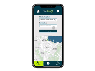
Getting some wireframe ideas down on paper as a guide before moving into Figma prototyping was helpful. In hindsight, I should have spent more time in the low fidelity stage than this, which would have saved me time later.
Prototype - v1 user testing
My initial design included the option to either search for a destination or select a specific service to filter results. But this proved confusing for users. Some of the feedback from iteration 1 testing included:
-
"The first screen is confusing - as a new user I want to be told what to do." - User Feedback
-
"I don't understand what the bottom menu means. If it is supposed to indicate a tab, maybe highlight that better." - User Feedback
-
"It's confusing why I'm setting a destination before a starting point." - User Feedback
-
"It's nice that I can choose a later time, but I'd also like to be able to check tomorrow's time tables." - User Feedback
-
"I really like that I can see a detailed trip plan. This is really important to me since I don't know the area well." - User Feedback
-
"I'd like the option to go back to the timetable screen after selecting a route." - User Feedback
-
"The idea of digital tickets and snapper right on the app is cool." - User Feedback
Iteration
After prototype v1 testing and the card sorting exercise, I went back to the white board to map out design changes. The feedback I got was really useful and helped me refine my approach in the right areas.


Prototype - v2
For prototype v2 I applied themes of feedback I received during testing and card sorting that occurred after creating prototype v1.
I also learned from my mistake on v1 where I did not leverage figma components correctly and failed to plan things out well up front. This time I established a good foundation of screen flows before building them out. I made as many components up front as made sense so that I could put things together more efficiently.
This still took a lot of time, but I'm getting more efficient with prototype design with Figma.


Conclusions
I know I have a long way to go when it comes to app design. My buttons are way too big for one, but I think some of my flows did prove my hypothesis: Users don't want to guess what they have to do - frustration and confusion, the opposite of the response we want, are app killers. An intuitive design, with a balance of simplicity and functionality, is a much better approach, especially for new users.
I was able to learn and apply the full end to end UX process at a high level, which I can now use in future projects.
References
Several icons, logos, and images used in my academic prototype were retrieved from the existing Metlink mobile app and from https://www.metlink.org.nz/ & https://www.snapper.co.nz/ and are owned by Greater Wellington City Council and Snapper Services, respectively.