
Data Visualization: Where are long term New Zealand immigrants originating from?
An academic case study iteratively exploring ways to visualize New Zealand long term immigration data through concepts that accurately represent their data sources.
What
This was an individual information design project focused on exploring ways to visualize New Zealand long term immigration data through four different concepts that aim to be both visually appealing and effective information radiators.
Why
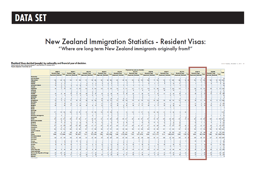
As an immigrant to New Zealand in 2019, I was curious who else was also migrating there. The New Zealand immigration public data available was not only confusing & convoluted in its present state, it also did not have any existing data visualization that effectively presented the information I was looking for.
I expected to see more American immigrants in New Zealand than there are. This led me to conduct this research to find out who is immigrating to New Zealand, and more specifically, who is applying for New Zealand Residency to stay long term.
Research & Design Process
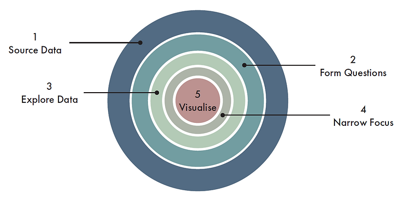
My process started with identifying specific questions I wanted to answer, researching and finding a high-quality data source, and then narrowing focus within my data set to answer that question.
"Where are long term New Zealand immigrants originating from?"
"What are the most common paths to residency?"
"What is the accepted and declined rate of residency applications?"
Next, I spent time exploring the data set to discover data visualisation opportunities and researching data visualisation techniques and tools.
My last step was creating and iterating on 3 concepts and then using elements of those concepts to create a final data visualisation that helps answer my original question.
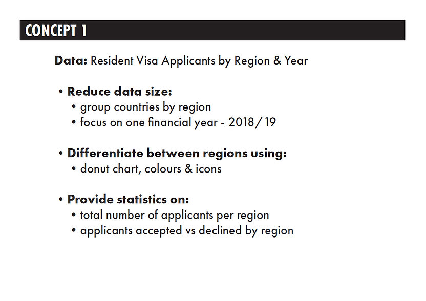

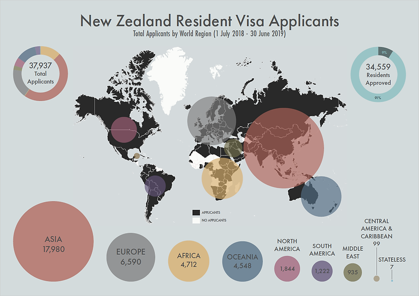
Concept 1 focuses on total resident visa applicants, and how many were approved or declined during the 2018/19 financial year, by region.
I ran into an issue trying to visualize data for every country who had an applicant. 151 country categories were way too many data points with far too wide a range to visualize effectively, so I made the decision early to bring this data set up a level by grouping countries into 8 common world regions: North America, Central America & The Caribbean, South America, Europe, Africa, The Middle East, Asia, and Oceania. I also needed to account for 7 applicants who did not have residency in any country, so I added a 9th region called “stateless”.


Concept 2 focused on Resident Visa application categories. Because there are hundreds of categories, I brought this up a level to application streams.
My goal for this concept was to answer how many resident visa applicants applied to one of the three application stream types, and find out if any stream had a greater decline rate than the others.
I built upon the pie chart concept I learned for concept 1 to display accepted and declined for each stream, and also made a new radial pie chart in the centre showing the percentages of each stream that make up the total.


For concept 3, I wanted to show country data, so I opted for a stacked bar graph that shows much of the same information as concept 1, but for the top 25 countries by region for 2018/19.
I really liked the idea of incorporating a map, so I generated a map using my data to group by world region. This turned out to be aesthetically pleasing, but also provided value as a legend for the bar chart above, adding additional context. This is probably the least effective of my concepts, because of the great disparity in data after the first 8 countries in the bar graphs.
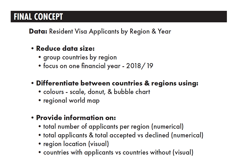
Final Concept
Each concept progressively iterated and explored data visualizations in different ways to build out a cohesive and complementary set. My final concept continued to build on all that I learned up to this point, but also took on the challenge of bubble charts. The human brain judges size by area instead of diameter, so this is a bit tricky. To create accurate circles, I used a mathematical equation involving square root and division.
Although there are probably more accurate ways to visualize numerical data than a bubble chart, for the purpose of answering my original question this both visualizes where and how many people are coming from different regions of the world, along with the my other concepts as additional context.